Pages

Saturday, December 13, 2014

Knitwear for the Feisty (and Cute Earrings!)


I have a friend and colleague named Kathy, who is also responsible for convincing me to become a technical writer. I am responsible for her learning to knit. So, all in all, I owe her more than she owes me.

We have now worked together at three companies—I seem to follow her around. (We also worked with mem at the same three companies, so the three of us go back more than 25 years.)

mem, Kathy, me

Google donates to many charities and encourages its employees to donate both time and money all year, but there is a particular week in June called GoogleServe, which has many scheduled opportunities. (I found this about some of the work that was done for GoogleServe in 2011 and the program continues to grow.)

Kathy and I belong to a group of knitters at Google in Mountain View who enjoy knitting together at lunch, and this group collectively knit around 150 chemo hats this year for Knots of Love. (Knots of Love also collects small blankets, but we learned of this a bit late before mailing off our hats in June. I'm sure that next year we will also knit up some of those.)

A few of Kathy's hats. She gave them to me to weave in the ends. (Since I'm a sewer, ya know, and well suited for that kind of thing. :) )

Kathy knit something like 16 adult hats for the contribution. (I was a late starter and knitted three using the patterns that Knots of Love provides.) Kathy's hats contained a special, secret, coded message. In Morse code, her hats spell out F*CK CANCER. (She included a note with each hat so the potential wearer would know about the coded message, in case it mattered, one way or another.)

I've been pestering Kathy for months to turn her design into a pattern, so that others can knit this hat. She has finally released a pattern, and she went one step further—in her blog post, she included a Morse code chart in her pattern so you can include a different message in your hat. Maybe you want to give a loved one a hat with the secret message "I love you", "stay safe", "blessings", or "do your chores".

Check out Kathy's free Morse Code Message Cap on Ravelry. She also put it on her (new) blog, Kat Knits (and Purls). It's a fast knit!


Cute Christmas gift: Earrings!

My kids do not read my blog, so I feel pretty safe in posting this before Christmas.

Recently there was a Holiday Bazaar at the San Francisco office where I work 2 days a week. There were a number of local crafts people vending their beautiful wares. Who doesn't love a good crafts fair? I bought some nice things for my kids for Christmas, and ONE thing for myself.

Just look at these cute stud earrings. This couple make incredibly cute sterling silver jewelry. These studs are tiny, but substantial, as they are cut out of thick sheets of sterling, but the buttons are a scant 1/4" in diameter.

These button earrings are for me

These are for DD1, who has 3 piercings in each ear and attends university in rainy Oregon

I just loved their jewelry, and they have a website. They also have jewelry that would appeal to guys. Maybe you know someone who would love Pac Man cufflinks, or pinwheel cufflinks that actually spin. Maybe you know someone who teaches chemistry and has multiple piercings.

Here are the links to the button earrings and the umbrella and rain earrings. (Disclaimer: I get nothing for sharing these links with you. I'm just a satisfied customer.)

I also bought earrings from another vendor. She uses pennies and dimes to make jewelry. I bought a pair for each daughter. The grumpy cats for DD1 and the owls for DD2. So cute!

I've turned one of the cat earrings over so you can see the penny.

Linda, the designer, was lovely and we had a nice chat as I was dithering over which earrings to choose. She also has an Etsy store, loaded with goodies. Here are her grumpy cats and here are her owls. Check her out! (Same disclaimer applies.)


I don't expect to be sewing much between now and Christmas, so I have nothing to show. I am busy preparing for the holidays. DD1 arrived back in SF last night. She and I will be together for much of the weekend before she jets off for several days in NYC.

Have a great weekend!

Thursday, December 11, 2014

Giveaway Winner and Eye Candy


The winner of the digital subscription to Selvedge Magazine is R. Trittel!

Please contact me, R, and congrats!


If you didn't win the subscription to Selvedge, here is something to inspire you. Check out some amazing eye candy—wearable art by Kay Khan!


We are experiencing some ark-building weather here in northern California—it's the "storm of a decade", which makes it a wonderful day to work from home. My cat, however, is fairly grumpy that there is no door into summer.

Monday, December 8, 2014

Greedy Gift Grab, How I Love Thee


Once again, this last weekend was the annual Greedy Gift Grab and sewing par-tay. This event is in the back of my mind all year long, and this year was no different. I usually make a gift, but this year I spied some lovely hand-turned seam rippers in Treadle Yard Goods in St Paul, Minnesota, and I had to BUY one for the gift grab!

If you want to order one, see my blog post for info. (I also gave one away for my blogiversary.)
At this point, I've bought four: two to keep (one resin, one wood) and two to give away (one resin, one wood). I love them that much and I've used both the wood and resin rippers more than I care to admit.
This wood is bamboo—Bill makes them in a wide variety of woods and I've encouraged him to set up an Etsy store so non-locals can view his pieces on the web before purchasing.

My biggest challenge when it comes to these annual gifts is the wrapping. I am not a Wrapping Queen. In fact, my poor children often had to make do with unwrapped gifts. Sometimes, I would just hold their gift behind my back saying, "pick a hand."

Sad, I know.

My friend Renee is a gift wrapper extraordinaire. She helps me sometimes, but most years I have to muddle through on my own. And you want your gift to look compelling so that it gets opened earlier, rather than later. I always hope that I have bought a gift that will appeal to several people—it's a lot of fun when your gift is "stolen" multiple times. For me, that is the most fun of the entire evening—watching people "steal" gifts back and forth. It's a hoot and these sorts of games work well when people share a passion (which these folks do), and also when they are good natured about it (which these folks are).

So this year I had an inspired idea for the wrapping. Why not use battery operated Christmas lights?!

I then hopped onto the internet and saw that my idea was hardly unique. Oh well.

I went to Home Depot (it's so nice that they are open at 7am on Sunday) and purchased a string of fancy pendant white Christmas lights for $15. They require 3 AA batteries. (These would look so nice all lit up in a bowl as a holiday decoration and I see they also have the same lights online in multicolor.)

It's safe to say that the lights were just as much a hit as the seam ripper!

I had an ornate inlaid pencil box I had bought years ago as a gift to one of my daughters, but hadn't used it. I placed the seam ripper in the pencil box, on a bed of tissue.

I placed the pencil box in a shoe box. I placed more tissue around the pencil box and laid the lights around the pencil box.

I switched on the lights and then wrapped the gift (sans lid) with two layers of lightweight paper: one layer of canary tracing paper that I use as my tracing paper for sewing and, over that, a layer of food-grade tissue paper—white with gold stars.

Voilá!
Added bonus! I bought this ribbon before I was married. I used up the gold wrapping this gift, and I plan to use up the rest wrapping Christmas gifts!

My little trick worked, as my gift was the first to be opened! (I remember one year my gift was the last to be opened, meaning there is no chance to steal it—that was the year I put no special effort into the wrapping. Once the last gift is opened, the game is over.)

So what did I bring home after the game was over?

I was very fortunate to win some beautiful fabrics, all ikats, that had been purchased when my sewing friend, Sarah B, had traveled to Burma, Cambodia, and Thailand. I had to steal these back numerous times, let me tell you! What a special gift! (And thanks to Sarah B for sharing her travel treasures!)

Antique Burmese silk

Burmese men's longyi

Thai silk

Giveaway Reminder

Just a reminder! If you haven't entered the giveaway for the free, one-year, digital subscription to Selvedge Magazine, go do it now! I will draw a name on Wednesday. If you haven't left your contact info, please check back. If we can't connect up within a few days, I'll draw another name.

What's up? Where's the Sewing?

It's true, this was a weekend of back-to-back holiday parties (I also attended a huge 40s-themed work party on the U.S.S. Hornet), so I got only a bit done. My friend, Renee, had loaned me a very interesting Cynthia Ashby skirt, and I finally got that traced off, which was a bit tricky, due to some funky curves, but not much else was completed, sewing wise.

But I've just made some holiday plans... Between vacation and paid time-off for the holidays, I will have TWO WEEKS off from work!!!! I am very excited and need to start thinking about what projects I want to work on during that wonderful block of time. Staycation, indeed! (Last year I had just started my new job and had zero vacation days. That's right, it's my one-year anniversary!)

Of course, I'll also hang with my kids, but I hope to finish a few things, or maybe work on something meaty.

Thursday, December 4, 2014

Selvedge Magazine (AND GIVEAWAY!)


I routinely receive emails where I am asked to review products in exchange for free product. 99.9% of the time I ignore these emails, as the products are things like nail polish, sunglasses, cheap RTW... items that have no relevance to my blog.

Several weeks ago I was contacted by Selvedge Magazine, and this time I was glad to accept a free copy in exchange for a review.

Back when Borders was a brick-and-mortar store near my home in SF, I loved to visit and look at the rack of international craft and fashion magazines, typically when the little ones were with daddy, so I wouldn't be distracted. One of my favorite magazines to peruse was Selvedge, published in England.

They sent issue 61, the "North" (winter) issue. The full title of the magazine is: selvedge: THE FABRIC OF YOUR LIFE and the tagline on the cover is "Textiles in Fashion, Fine Art, Craft, Design, Interiors, Travel and Shopping." That pretty much sums up their offering: an interesting collection of global, historical, and contemporary information and inspiration in fashion, craft, and industry. They cover the gamut, but this is not a magazine of patterns—it's for textile-inclined artists and all lovers of textiles.

I've peppered this post with a sampling of photos from the issue so you can enjoy some of the eye candy.

I've just learned that Selvedge now offers digital subscriptions, which is a great money saving (and space saving) option! (You might also be interested in following their Facebook page.)

GIVEAWAY FOR FREE SUBSCRIPTION!

Selvedge Magazine has kindly offered to to give away a free digital subscription to one of my readers! If you would like to enter the drawing, please leave a comment on this post. I will draw a name next Wednesday. THANKS!


What's Up?

Wow, it was nice to have 5 days off last week, with Thanksgiving break and a bit of vacation thrown in.

I did not sew one stitch.

Instead, I read, knitted (a disappointing hat), cleaned, decluttered (preparing for the holidays), spent a day hanging out—and making fudge—with one daughter, had mega phone conversations with the other, binge watched murder mysteries, caught up with Serial and my favorite "reality" TV show, Anna Wintour's Fashion Fund...and just generally enjoyed not sewing.

Since Thanksgiving, it's (finally) been raining. A lot.

mem and I were walking back from lunch and I spied someone snapping this cell photo, with us in the background. I asked him to send me a copy. (And later discovered that I was imposing myself on one of our VPs. :)

Over Thanksgiving, DD2 thoroughly enjoyed the 60°F San Francisco weather, where "the air doesn't hurt your face." When she returned to Minnesota, it was 0°F.

Wednesday, November 26, 2014

Double Sided Wool Jacket


Happy Thanksgiving Eve, to those of you who celebrate the U.S. holiday.

I am as happy as a pig in slop to be at the beginning of a 5-day vacation! Not to mention that DD2 returned last night from university in Minnesota. As soon as she got off the plane, she was waxing about the joys of feeling warm air all around your body. I don't think of San Francisco as being "warm" much of the time, but it just goes to show how it's all relative. Though I think you can see that she is not unhappy with her new Joan of Arctic boots from Sorel.

Back in Minnesota... (where it's been snowing already)

If you follow the Britex blog, you'll see that I've completed another project, my last one for 2014. This time, I started with a 100% wool from the Mid/Light Weight category:

Midweight Reversible Navy & Teal Wool

In the description, they call this a "midweight reversible wool", but I would characterize it as more lightweight. I love reversible fabrics, and I love navy and teal—I've been sewing more with these colors lately—so I jumped on this fabric almost immediately.

Some of my pics show the teal side as more of a blue teal, but it is more of a green teal, as shown in the photo on the Britex site.

This is one gorgeous fabric. I machine washed and dried a sample: It did not change character or hand. It might have shrunk a bit—I didn't think to check. The sample did fray beautifully, which surprised me, as the fabric was not particularly ravel-y to begin with. But I made sure that I serged the edges of the yardage before subjecting it to the washer and dryer, as I was not going for a frayed-edge look this time.

I found this fabric very easy to sew and wanted to make use of the fact that it was reversible. There is no pattern available for this jacket, as I used a pattern, borrowed from a friend, that was traced off of an actual Issey Miyake Plantation jacket from the early 1990s.

Single welt pockets. The sleeves fold back to reveal the teal.

I love Issey Miyake designs, but they don't always love me. The original jacket was rather boxy, long, with dropped sleeves, and no internal seaming, other than the shoulders. (In other words, the original jacket had the loose fit with dropped sleeves typical of that time.) It features a "fold back", soft lapel—finished with mitered edges—that is sewn into the shoulder seam. This fold-back lapel is my favorite feature of the design.

I made lots of changes to the original pattern. I added center back and side seams, and introduced some shaping in those seams. I reshaped the armscye and swapped in another sleeve that has a more traditional sleeve cap. This turned out to be tricky, as I muslined the sleeve at least 5 times and I think it could use more tinkering.

I reshaped the hem—it's shorter in back, but dips to the original length in front. I re-shaped the front lapel, narrowing it so that I could raise the armscye—I also changed the angle of the lapel so that it "broke" (turned back) in a more flattering (lower down) location, creating a more vertical line.

The side seams, CB seam, and sleeve seams are flat felled

Don't you just love flat felling the seam on a one-piece sleeve?

Yes, that was sarcasm. ;)

I swapped out the welt pockets for my own welt pocket, as I no longer had the room to accommodate the original vertical, two-lipped, welt pocket with a large, very Miyake, pocket bag.

So, yes, this one required a lot of changes!

Conclusion:

This was a fun (and challenging) exercise! I do think I will use this lapel again, but I might just transfer it onto another TnT (tried 'n true) pattern. And I highly recommend this beautiful fabric!

Thanks to Britex for providing the fabric and thread!

And thanks to mem for taking these pics!

Monday, November 17, 2014

In Search of a Miyake - Vogue 2126


Edited on 11/18/2014:

Thanks so much to Rhonda Buss! She has been able to help Anne Marie out!

I agree that it would be fabulous if Vogue would re-issue these classic Miyake patterns from the 80s, but I don't think that will ever happen. For one thing, they would have to renegotiate the contract with those who are running the current Miyake design house and I think that it is just not feasible, more's the pity. It's really great when people can work out a sharing situation. Thanks again, Rhonda!


A sewing pal, Anne Marie of le mani d'oro, is in search of an out-of-print Issey Miyake pattern (from 1998) to sew a dress for a very special event.

She is happy to buy, or rent, this pattern (in an XS-S-M) for a reasonable price.

If you can help, please contact her through her blog post.

I was busy sewing this weekend, but have nothing to show you quite yet.

Have a great week!

Saturday, November 8, 2014

Tech Tip: Resizing Images


One thing that can drive me a bit batty is loading a page with a lot of images and those images draw very slowly. Watch the images slowly render... cachunka, cachunka, cachunka.

Maddening.

Especially because all of that extra resolution is completely wasted.

So I thought I'd offer some tips on how to resize your images to make them more online friendly. Please let me know if this post is of interest to you, as I have ideas for other posts of this type.

TOC:

Generally, slow image rendering happens when a picture is saved at a much higher resolution than is needed. You can greatly improve the performance of loading a page if you reduce the size of your images so that they are closer to the resolution that you need, and not a lot more.

(Note that this info is also useful for emailing images. It's much better to size an image down so that it fits into a mail window, rather than sending a huge picture that is impossible to see without opening it into another app.)

There are two ways to change the size of an image. You can:

  • Reduce the default resolution in your camera—This means that the pictures that your camera takes will have a smaller file size. More of them will fit onto your camera memory card, and they will will upload faster to your computer.
  • Reduce the resolution in post production—after you have uploaded your images to your computer.

I don't use the first option. I want my photos at the highest resolution. For example, if Vogue Patterns ever comes calling and wants to feature you in their Star Blogger column, you need print resolution, which is much higher resolution than is required for online images. For this reason, before I alter an image, I make a copy of it. I never alter the original image, in case I need it later at the highest resolution.

My camera is a Canon Digital Rebel Ti3, which takes images at very high resolution. My computer is a Macbook Pro, so I will explain how to modify the resolution of your images using a tool available, for free, on any Mac. (But I include a link to info for those of you who are using Windows.)

The following screenshot shows the info for the original image of my Fly London shoes. You can see this info if you select the image in the Finder and then select File > Get Info (command-I).
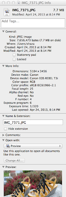
As you can see, the original image, at 72 DPI (screen resolution is 72 DPI), is SEVEN-POINT-SEVEN MEGABYTES and it is 5184 pixels by 3186 pixels. That is a big file. Imagine a page full of 7.7 MB images. It's very slow for the browser to load all of those huge images and all of that extra resolution is completely wasted. You don't need it. Most laptops, for example, are somewhere around 2000 pixels across by 1200 pixels high. So an image that is over 5000 pixels across is serious overkill.

So, how do you decrease the resolution and what resolution do you decrease it to?

Resizing Images

On the Mac, you can change the resolution of an image using Preview. (Here are instructions using Paint for Windows.)

  1. Open a copy of the image in Preview, which is an app included on every Mac.
  2. Select Tools > Adjust Size... This brings up a window:
  3. To the right of the Width and Height text fields, select Pixels. (I prefer to work in pixels, rather than percentages, where you are guessing about the number of pixels.)
  4. Make sure that Scale proportionally and Resample image are both checked. "Scale proportionally" means that you only have to enter one dimension, such as the width, and it will alter the height to maintain the same aspect ratio. "Resample image" means that you want the file to be modified. If you don't check this it will not actually make the file any smaller, but will only alter the header information.
  5. Enter the desired pixel width in the Width field. I usually change the width to 400 pixels. The maximum image width that Blogger likes is 400 pixels, at least for the template that I use. Any wider and the image (at full size) starts to creep into the sidebar.
  6. To see what this image will look like at its maximum size, select View > Actual Size (command-0). Is the image still too big? You can resize it further. View > Zoom to Fit (command-9) will fit the image into the Preview window.
  7. Save the file and exit Preview.

For comparison, examine the modified image using Get Info:
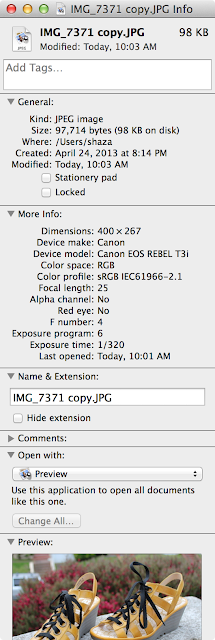
As you can see, the modified image is 98 KB, which is, approximately, ONE TENTH of a megabyte, or .098 MB. This is SEVENTY EIGHT TIMES smaller than the original image. It will render much more quickly.

Drawing an image at different sizes

Now, let's say that you want to draw your image at a specific size without making the image smaller. For example, I save copies of my images at 400 pixels wide, but I might want to post them on another website at an even smaller size. Maybe I want to display an image at 200 pixels, or 288 pixels. You can make a copy of the image and re-size it, as I describe above, but I typically don't. In this situation, you can just display an image at a smaller size without modifying the actual pixels. (Drawing a 400 pixel image at 200 pixels is not going to greatly impact performance of the browser, unless there are a lot of them.)

Most photo sites, such as Picasa, let you select a pixel size for displaying an image.

When you select one of these sizes, Picasa is not actually changing the size of the image file. It is providing you with a snippet of HTML code that tells the browser at what size it should display the image. Here is a sample of HTML code for displaying an image:

<img src="https://blogger.googleusercontent.com/img/b/R29vZ2xl/AVvXsEhvkqAQzgMhBiyAAAPQ-WzRX1MzTvMbGLDdbabAma9BXfCMqpSIkJBPCXanwb5spRXx8vy3lBTgvrIjDzMeOiW_X1mxm-GTwrDpTWE0mFnIEeD2RrcgBFtA7JuMKp7GybpnA8jvs5bDlag/s800/IMG_7371%2520copy.JPG" height="267" width="400" />

Let me break this down a bit.

To display an image in HTML (which is the language of the web), you specify the following:

<img src="location of the file on the web" />

That's the bare minimum you need for displaying a picture. For example, say you want to display an image from the BMV website. You can go to the BMV website, and find a page that contains the picture you want to display. For example, go this page, right click over the image on the page, and select Copy image location. The location of that picture is now in your copy/paste buffer.

You can replace the "location of the file on the web" text, so that the HTML snippet looks like this:

<img src="http://voguepatterns.mccall.com/filebin/images/product_images/Full/V1426.jpg" />

When you paste this snippet of HTML into the browser page that you are editing and update it, you will see this:

But this HTML displays the image at its maximum size. To display an image at a smaller size, you can add width and/or height attributes, like this:

<img src="location of the file on the web" width="number of pixels" height="number of pixels" />

(You can specify the dimensions in pixels or as percentages, but I'm using pixels here.)

So, if I add the following to the HTML snippet:

<img src="http://voguepatterns.mccall.com/filebin/images/product_images/Full/V1426.jpg" width="100" />

I only specified the width (of 100 pixels), because a browser is smart enough to calculate a height that will maintain the same aspect ratio. The image will now display like this:

Maybe I want to try it at 288 pixels wide:

<img src="http://voguepatterns.mccall.com/filebin/images/product_images/Full/V1426.jpg" width="288" />

Which looks like:

You can display an image at any size that you want, so long as it's the same size or smaller than the actual image. Trying to display an image at a larger size than the actual image will only result in a blurry mess. The browser can't add pixels that aren't there.

I hope this isn't as clear as mud. :)

I am spending the weekend on detail work: making pockets, and hand sewing. I'm a happy camper, and maybe I'll have something to show next week.

Have a great weekend!